Deciding on the logo for your food truck may be one of the most important decisions any food truck owner can make. Any well-branded truck can draw a crowd, and the more it stands out the more people will come and look at it. And looking often leads to buying. Your logo is a huge part of branding for your business, and is usually a visual representation of your brand name. It can also show off the delicious delights that you are selling, and can attract people from afar, if it is noticeable enough.
Ideally, your logo should showcase your truck, and should be able to stand out in the busy crowds of a city. It can be fun, funky, fruity, and flavorsome, but it must be part of whom and what you are and stand for. Food truck logos can be vibrant and quirky, and have their own unique charm that restaurants can’t get away with usually. Your truck is a moving billboard, and you need to be seen wherever you go. So take a look at our list of tips and tricks to make your logo extremely effective for as little as possible.
- Keep it Simple
- Try not to be too literal
- Avoid the trends
- Size IS important
- Limit your color range
- Don’t overcrowd the logo
- Use easy-to-read fonts
- Make it easy to describe
Keep it Simple
Simple logo designs are more effective
Your logo should be designed to draw in customers, and the easier it is to see and read, the more people will know what you sell from a distance. If it can’t be seen well from afar because it is too complex, then people will head for the truck they can read better.
Maintaining the simplicity of the logo is an important aspect of custom logo design, So that it can be easily readable to everyone. People tend to prefer simple designs and are more attracted to them, not to mention that the simpler designs are more memorable in the long term.
Try not to be too literal
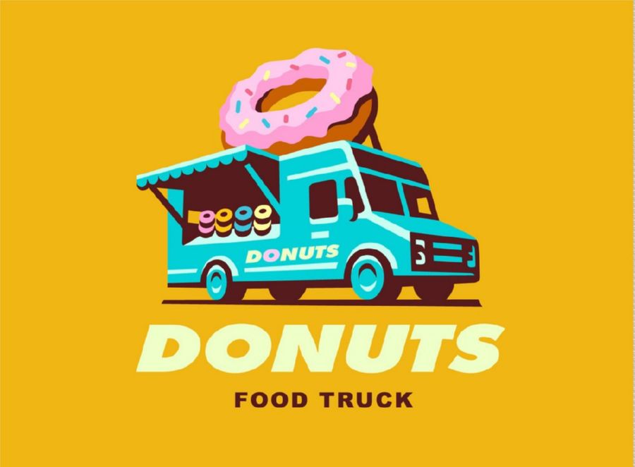
Don’t be too literal in your logo design
The most effective logos are those that can communicate with your target audience and deliver the brand message with ease. But you don’t have to be too literal in your branding with your logo. A little creativity and simplicity delivers the message just as well. Relating your audience to your branding can help to create a better logo design. And tagging a short slogan into the logo can help relate to your audience and deliver the message you want people to hear.
Avoid the trends
A logo that follows trends needs to be changed more often
While people do tend to associate with what is currently trending, it is not such a good idea when you are designing your permanent food truck logo.
Trends change, some fast some slow, but always changing. Your logo is going to be with you for years, and you need it to last and be timeless. What is cool today may not be tomorrow, and simple adaptation over the ages is easier than a complete change of logo with the passing trends.
Size IS important
Keep an aspect ratio so the logo can be resized easily
One that we hear in other walks of life, size does matter when it comes to logo design. But not in the way you might think. When it comes to the size of the logo, it all rotates around ratios, and how they translate to size. What may look good as a huge logo on the side of your truck may be unreadable when printed smaller on your menu cards.
And vice versa, smaller logos may have unforeseen elements that dominate when you blow it up to paint it on your truck. Maintaining the proportions of the logo design, and keeping ratio aspects in mind, will help to improve your logo’s readability no matter its size.
Limit your color range
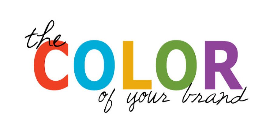
Limit the number of colors to just two or three
A colorful logo is bound to catch people eyes. But that doesn’t mean they will necessarily be able to understand it. Your selection of colors should be appropriate for your brand, and you should communicate this to your customers through your use of color. Most brands have a theme based around just 2-3 colors, and this has a major impact on your business, since each individual color portrays its own meanings.
Typically, green is used for organic, red to increase appetite, etc. The strong visual appearance of the logo will help to draw customers to your truck. Research has even shown that people often make subconscious judgments based on color alone.
Don’t overcrowd the logo
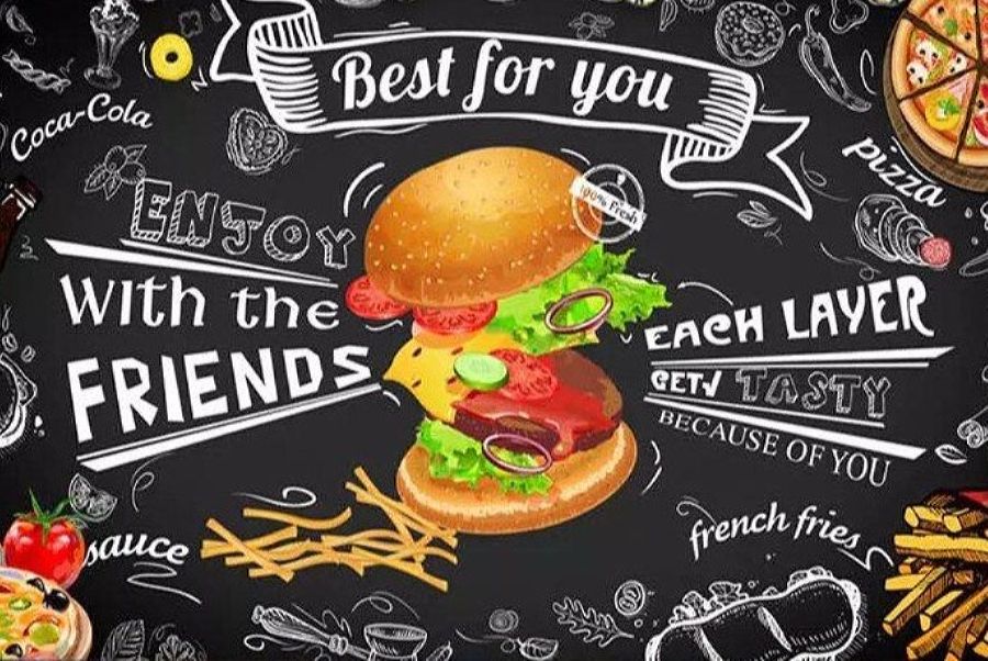
An overcrowded logo is hard to understand
Another way of keeping things simple with your logo is to refrain from making it too crowded. The main aspects of the logo should be easy to read and understand, and cramming too much imagery or too many words into the logo makes it hard to read or see properly. And this can have a negative impact on your custom.
Often, it is the simplest logo that has the greatest impact, for being so simple and easy to remember. Nothing about the logo should be arbitrary, and the design should be deliberately chosen to appeal to your target audience.
Use easy-to-read fonts
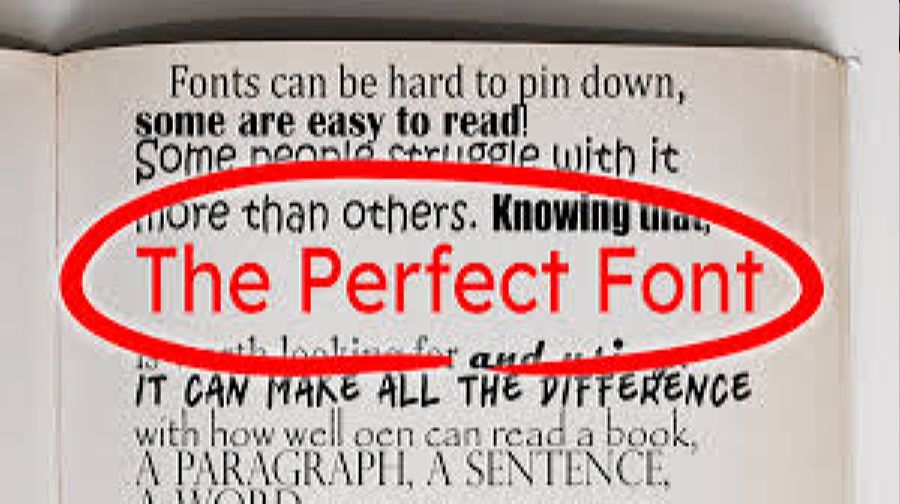
Make sure your customers can read your logo font
There are thousands of fonts to choose from out there, and the trick is to find the one that best matches your brand while being easy to read. Some fonts, as nice as they are, are not the easiest to read on the logo, so play around with fonts and find the one that your customers will recognize as your own, and can read without squinting.
Make it easy to describe
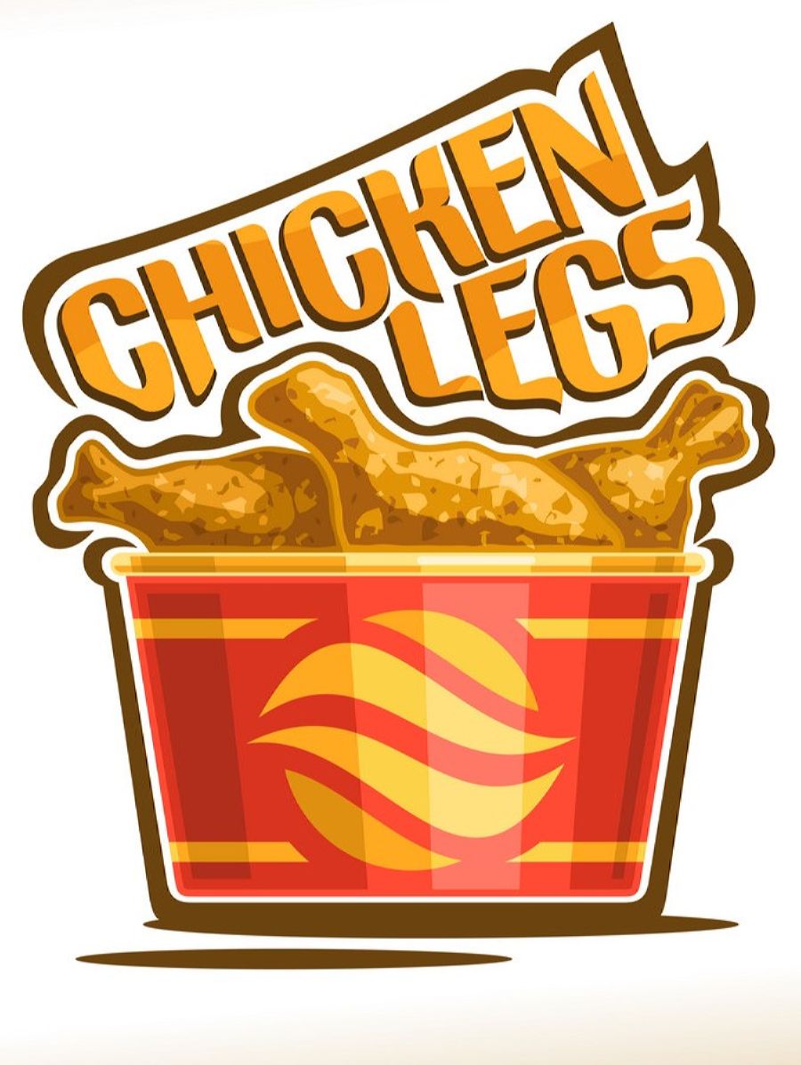
Word of mouth is an important marketing aspect
Word of mouth is one of the best forms of advertising, and for many food trucks, this is the most common way of becoming well known. A complex logo that is hard to describe is going to be recommended less often than one that is easy to describe.
While the name and brand can be easily communicated, people will look for a logo more easily, and if they can recognize your logo from another customer’s description, then you have the whole word-of-mouth marketing cracked.

Leave A Comment