No matter the style of food establishment you are running, you really need to understand at least a little about marketing and psychology in order to better promote your brand. And this goes double for food trucks, which often have more passing trade than standalone restaurants and cafes. Being on the street gives food trucks an advantage, but if you want to take more advantage of your passing customers, and entice them to come back again for more great food, then having a menu card they can take with them is the best option.
Menu cards should be given to every customer, so that they can browse the menu while they are eating your delicious food, and consider what they might like to get for tomorrow. Takeaway restaurants have flier menus you can grab from the counter to take home so you can order other food over the phone or online. Food trucks can use the same strategy to entice customers back for more using menu cards that make the customer excited to eat there again. You can even use them to allow your regulars to pre-order food before they arrive at your location.
- Research Menu Cards
- Keep Text Simple
- Provide Photos
- Choose Appropriate Colors
- Align to your Brand
- Utilize the Space
- The Devil is in the Details
Research Menu Cards

Research on the internet for menu card ideas.
Every food truck needs menu cards, even if you did not yet realize it. In order to create the finest menu card possible for your food truck, you first need to do your research and find out what attracts people most with menu cards. Is it the photos, the descriptions, the details, the imagery, or the flashy colors?
The reality is, none of the above, and all of them. Everyone is different when it comes to what attracts them to return to a food truck for more dishes. It is all about knowing how much of what to put where. When you browse the web, you can see millions of different designs for food truck menu cards, just try Googling (yes, that is a real word now!). And you can see what appeals to you, and what kind of menu card design matches your own food truck brand.
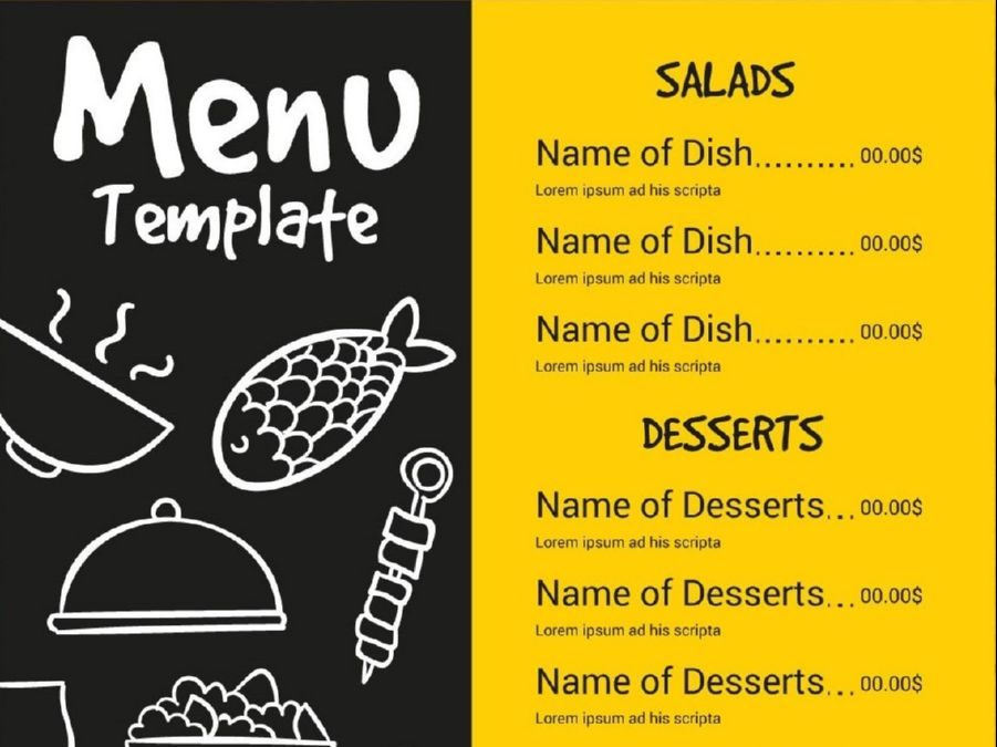
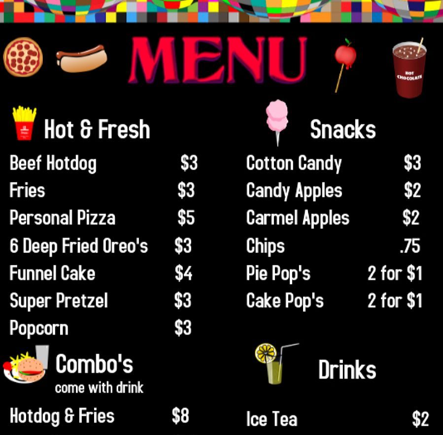
Websites such as Canva.com can help you to make your own menu cards, which you can save and print at home without the excessive cost of design and printing using specialist companies. And the templates available are extensive and colorful. Or you can use them as inspiration for your own personalized design.
Keep Text Simple

The text should be simple and easy to read
One thing to remember with a menu card for a food truck is to keep it simple. Too much text can be off-putting for fast-foodies, and they want to be able to know almost instantly what each dish consists of. A simple line description, if the content of the dish is not immediately obvious, beats long descriptions of the whole meal.
For example, “2x¼lb patties with BLT and pickles in a sesame bun” is long enough. And try not to make it too small to read easily. Your customers want to be able to scan the menu card and immediately see what they are looking for.
Provide Photos

Your food should be the most appealing element of a menu card.
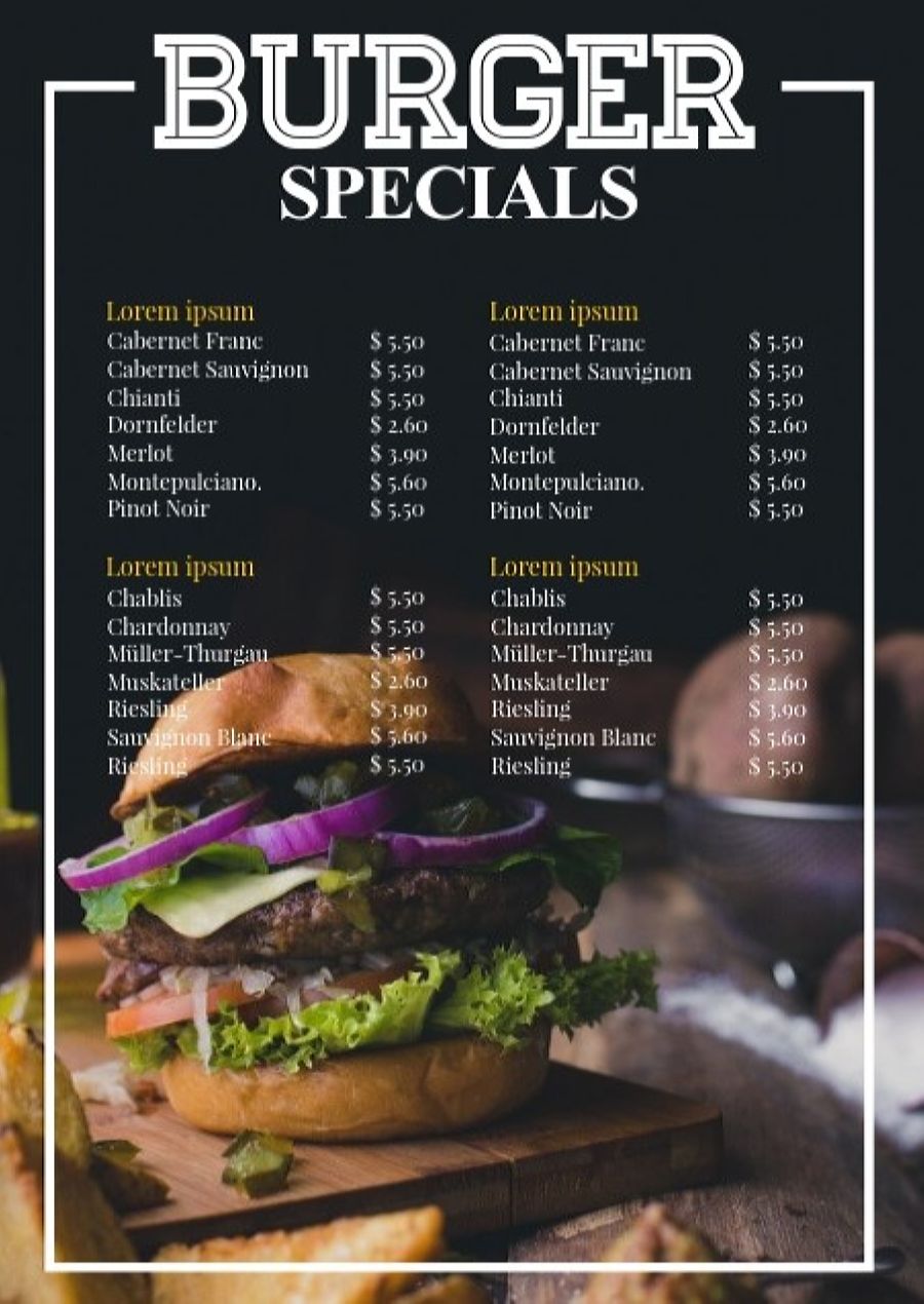
And this is where the photos come in. Not only do photos beside the item descriptions make it easy to see what each item is, but everyone loves food porn. Colorful, vivid photos of each item on your menu card lets your customers see each item fast and easily, and should be large enough for the customer to be able to see what is in the dish itself.
And using your own food porn photos is even better. This way, when they see the photos of the things you sell, they know that what they see in the picture is what they will be given when they order. And that helps to set their expectations for the other dishes you have on the menu. There is nothing worse than having wonderful photos that do not look like the food they bought.
Choose Appropriate Colors
Color is attractive, but too much color can be a little off-putting in a menu card. Keeping it bright and cheerful is the better option, as it highlights the photos, without taking the eye of the customer off the food images themselves. You want your customer’s attention to be drawn to the food, not the swirly colorful design too much, so keeping it simple but colorful is the way to go.
Many food truck menu cards do tend to have a black or white background, to better highlight the colors of the photos, and to make the contrasting text snap out at the viewer. High contrast is better than similar colors, so that it can stand out against the background better. So consider which colors go with your brand design before choosing the background for the card.
Align to your Brand
The design of your menu cards should be aligned to the brand logo of the food truck if you have a specialized logo. And the brand logo must be at the top center of the menu card, on both sides, so that your customer can see whose menu card it is at a glance.
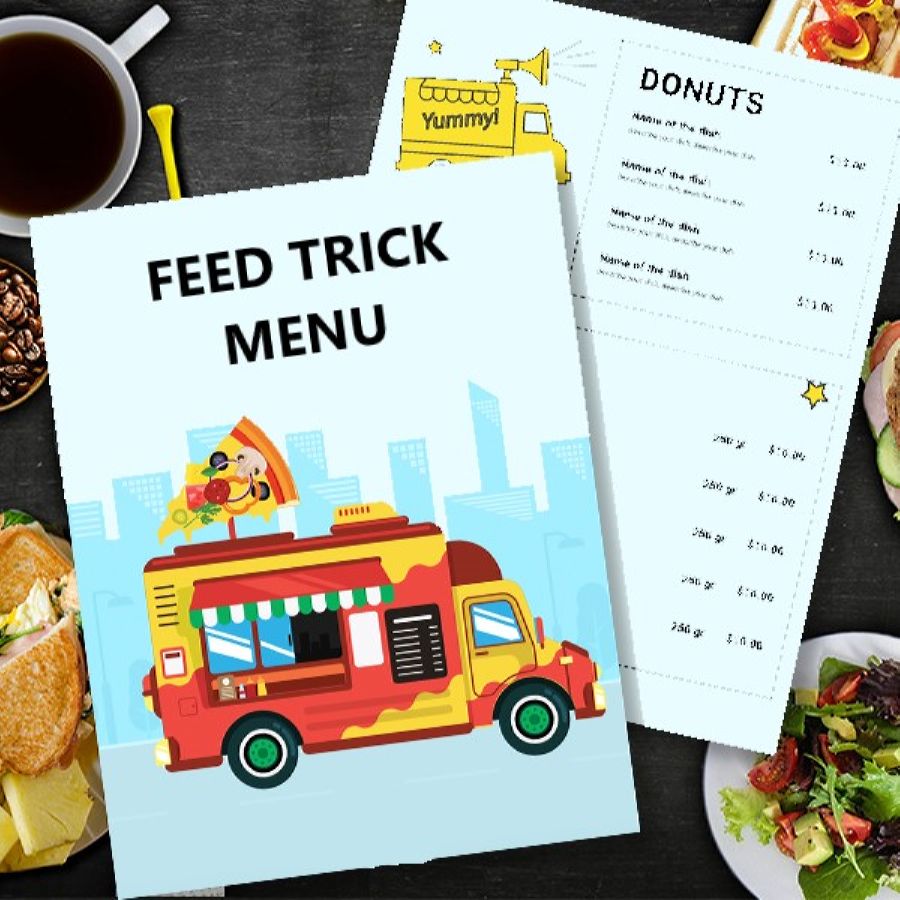
The shape of the menu card can also be part of the alignment, and it is possible to get menu cards shaped like your food truck, or just a rough food truck shape. However, while this is a nice little design trick, remember that your menu is going to be in their pockets, so make sure the edges are even. The less crumpled it will get in the butt pocket of their jeans, the more chance they will keep it when they get home.
Utilize the Space
Once you have your ideas, you can mix and match them up, and decide on a final design, which has the right page size and style. One good tip here is to make it easy to fit into the pocket, so large sheets are not really appropriate. Back to back A5 size is ideal for this. And you can fit your entire menu on both sides.
Utilizing all the space available is important, but you also need to be aware that it is confusing if the menu items are all crammed together and hard to read. The simplest idea is to have the photo next to the line item, and then the price. The menu card should have spacing between the images to give allow the customer to read the menu more easily. And you don’t need to use every millimeter of space on the card.
Another good tip is to promote the top items you sell on the main side of the menu card, with slightly larger photos and text that stand out more. Your bestsellers need to be the first thing they see, not hidden away within the menu.
The Devil is in the Details

Details are important in creating a professional food truck menu card.
Your menu card may be for a food truck, but you need to remember that this is part of your branding, so the menu cards must be free from inconsistencies. Misspelled descriptions or dishes, covered prices, and poor quality will distract the customer from the menu itself, and detract from the image you are trying to create with your brand. And that often ends with them eating elsewhere.
You need to pay full attention to the details when creating your menu cards, and proof read it several times before the final print. People do have a habit of sharing menu cards around, and your menu card can be an introduction to your food truck for new customers. You really need to make that great first impression.

Leave A Comment